Case Study · Logo Design & Branding
EcoSphere
An eco-friendly and sustainable small-scale business.
EcoSphere is a small-scale business dedicated to promoting eco-friendly products and sustainability practices. Their mission is to inspire consumers to make environmentally conscious choices and support a greener future. As a designer, the goal was to create a logo that reflects EcoSphere’s values and resonates with its target audience.
Color
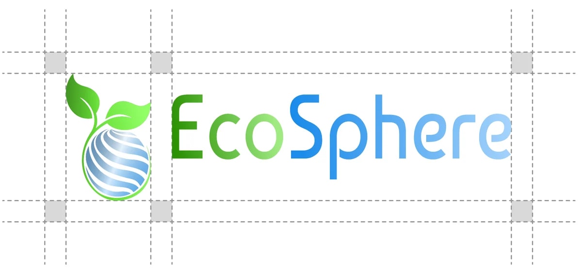
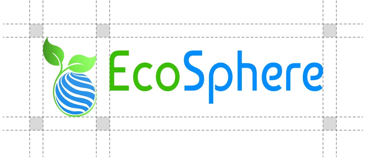
Blue and Green as a branding colour
- Blue represents trust, reliability, and calmness. It is also associated with water and the sky, which ties into environmental awareness and sustainability.
- Green is universally recognized as the color of nature, growth, and sustainability. It symbolizes health, renewal, and eco-friendliness.
Why these colors:
- Blue and Green Together: The combination of blue and green creates a balanced and harmonious palette, reinforcing the idea of nature’s balance.
- Messaging: These colors visually communicate the brand’s commitment to ecological responsibility and its vision of a sustainable future.
- Customer Perception: They evoke trust, inspire action toward eco-conscious choices, and resonate well with an audience seeking environmentally responsible products.
- Blue#008DFF
- Green#38BE03
- Black#000000
- White#FFFFFF
Typography
Baumans