Bytes & Beyond

UI/UX Case Study

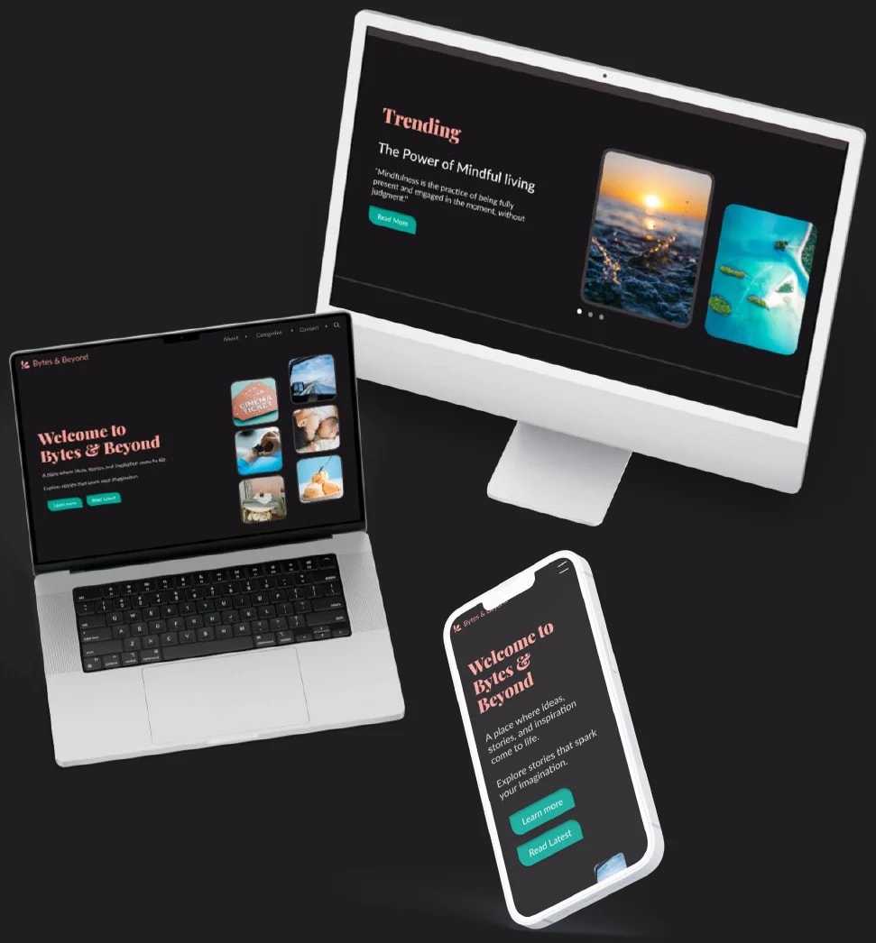
The Bytes & Beyond blog on a desktop monitor, a laptop and a phone

Project Overview

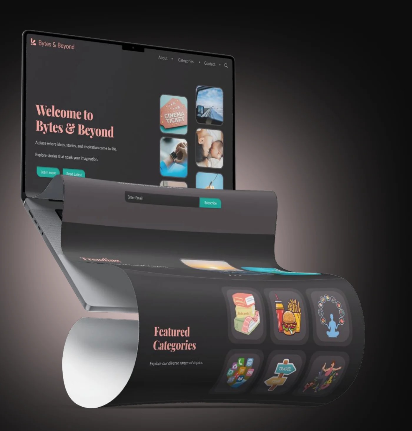
The Bytes & Beyond homepage on a laptop, with the page curling out of the screen to show the Featured Categories section

Goal

Create an engaging blog platform that covers Travel, Food, Mental Health, and Women’s Wellness while fostering a supportive community.

Problem

  • Low user engagement and high bounce rates.
  • Difficult navigation with outdated design and lack of accessibility.

Solution

A modern, user-friendly interface with clear navigation, accessibility features, and a visually appealing design system tailored to the target audience.

  • Project
    Duration

    2 weeks

  • Tools Used

    Adobe Illustrator, Canva, Figma, Framer and Notion

Design Process

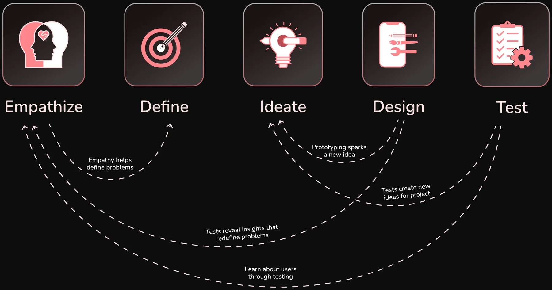
Design process in five stages: Empathize, Define, Ideate, Design and Test, with loops back: empathy helps define problems, prototyping sparks a new idea, tests create new ideas for the project, tests reveal insights that redefine problems, and testing teaches more about users

Site Map

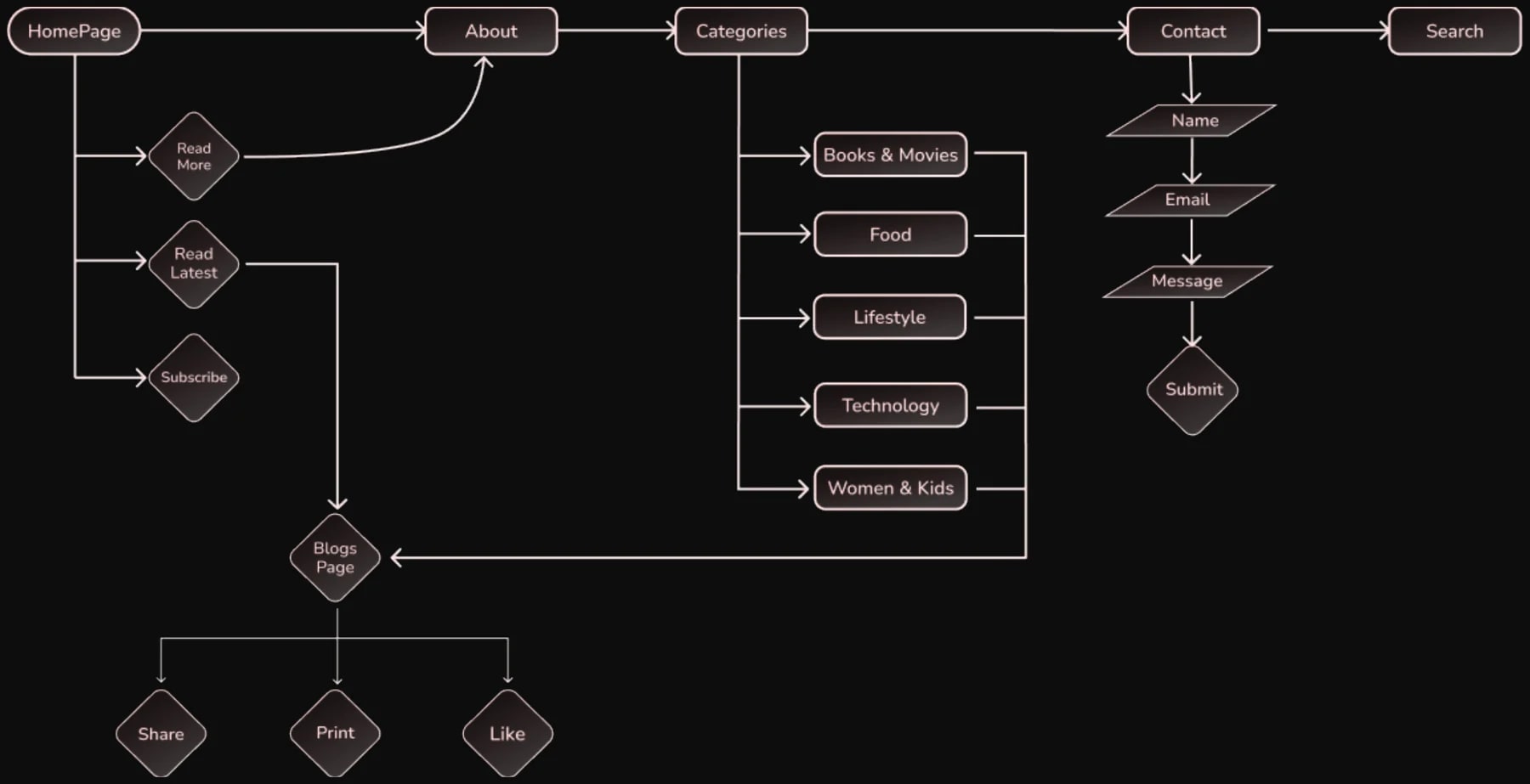
Site map: the Homepage links to About, Categories, Contact and Search. The homepage offers Read More, Read Latest and Subscribe. Categories lead to Books & Movies, Food, Lifestyle, Technology and Women & Kids, which all open the Blogs page, where posts can be shared, printed and liked. Contact asks for name, email and message, then Submit
Swipe sideways to see the whole site map.

Design System

Typography

Playfair Display

Black

AaBbCcDdEe
1234.-

56 px

Lato

SemiBold | Regular

AaBbCcDdEe
1234.-

18 px24 px40 px

Colors

  • #FFA199Primary
  • #00A795Secondary
  • #007467Hover
  • #FFFFFFBody
  • #2B2629Section
  • #181618Background

Icons

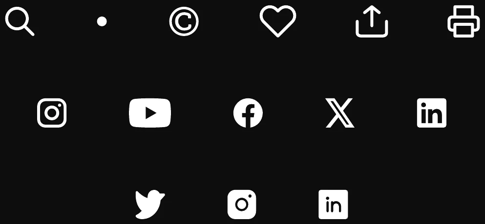
Icon set: search, dot, copyright, heart, share, print, and social icons for Instagram, YouTube, Facebook, X, LinkedIn and Twitter

Logo

Bytes & Beyond logo: a coral leaf-shaped mark beside the name

Components

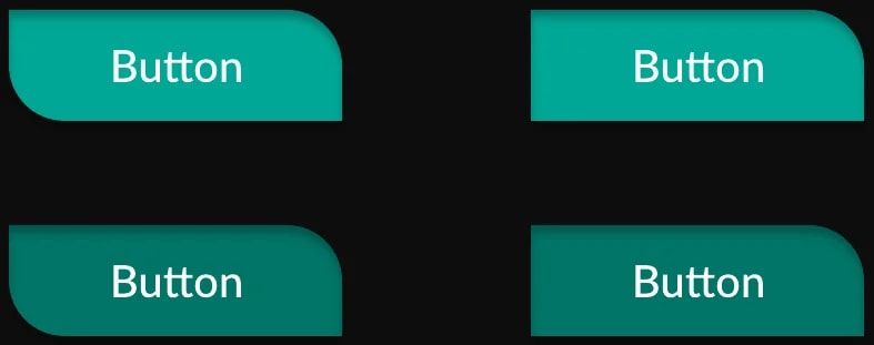
Button components in teal: default and hover states

Wireframes

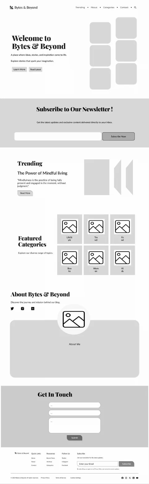
Grey-box wireframe of the full homepage: hero, newsletter sign-up, trending post, featured categories, about section and contact form
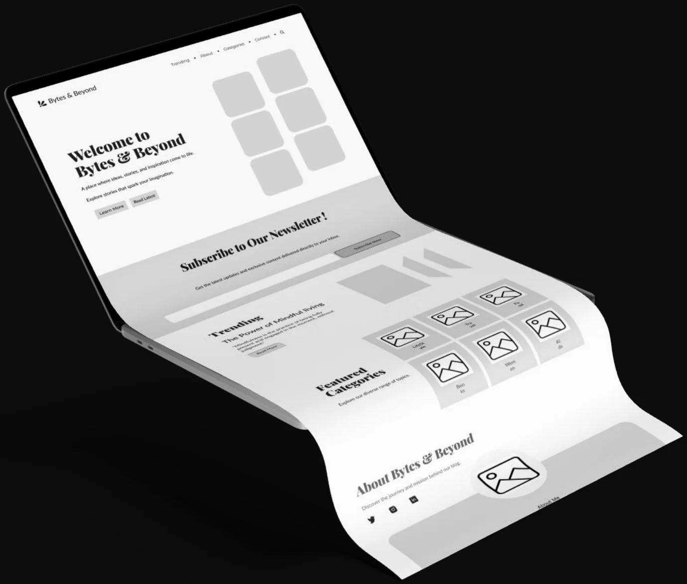
The homepage wireframe shown as a curved sheet coming out of a laptop

UI Screens

  • Featured Categories screen with six illustrated category cards
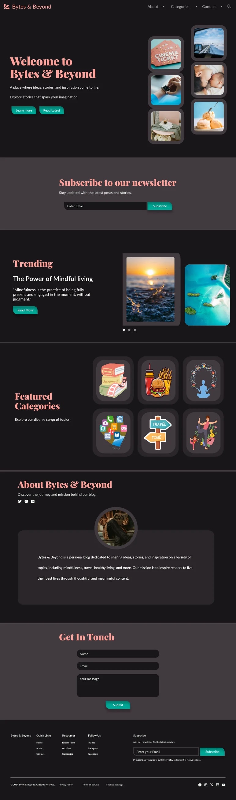
  • The full homepage design: Welcome to Bytes & Beyond hero with photo cards, newsletter sign-up, trending post, featured categories, about section and contact form
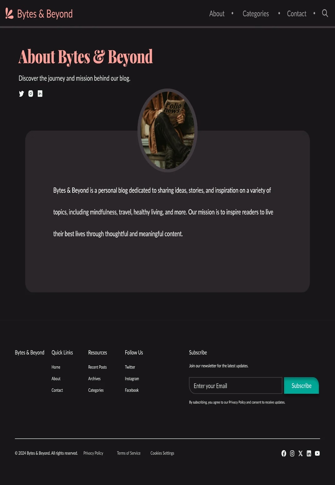
  • About Bytes & Beyond page with the author photo and the blog’s mission
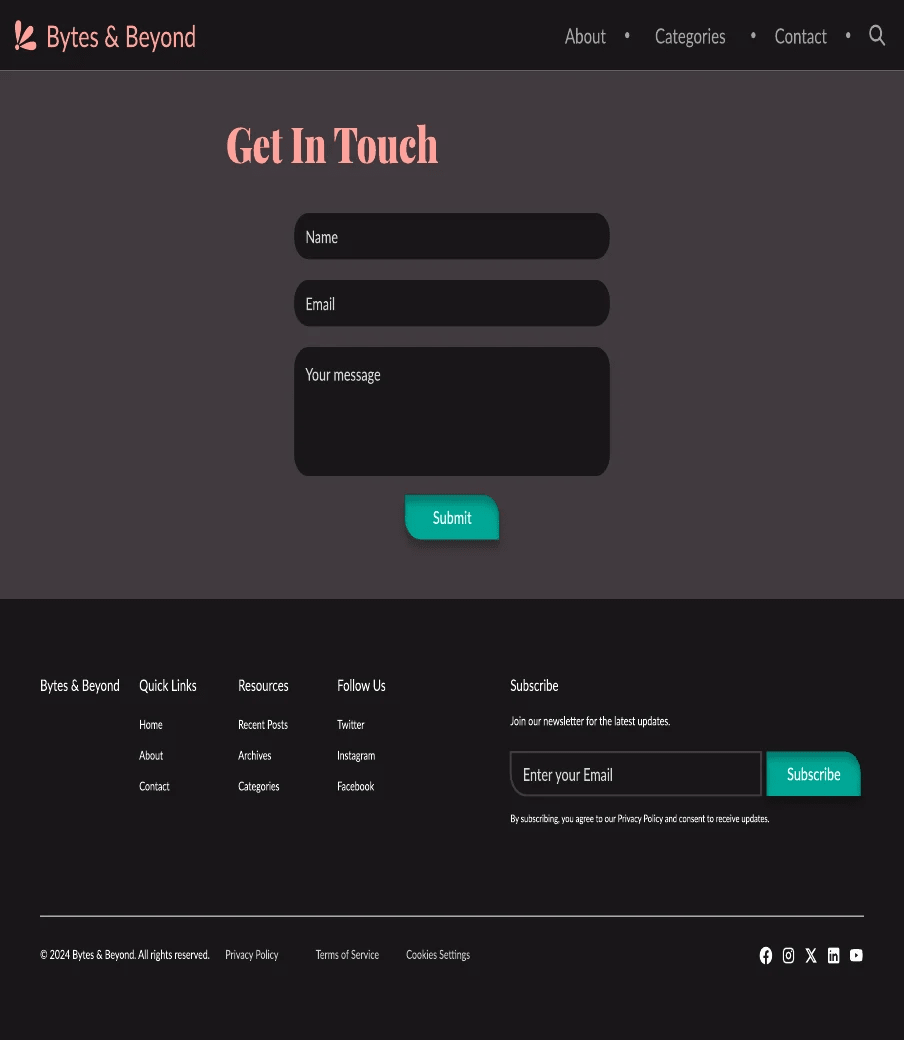
  • Get In Touch screen with name, email and message fields and a teal Submit button
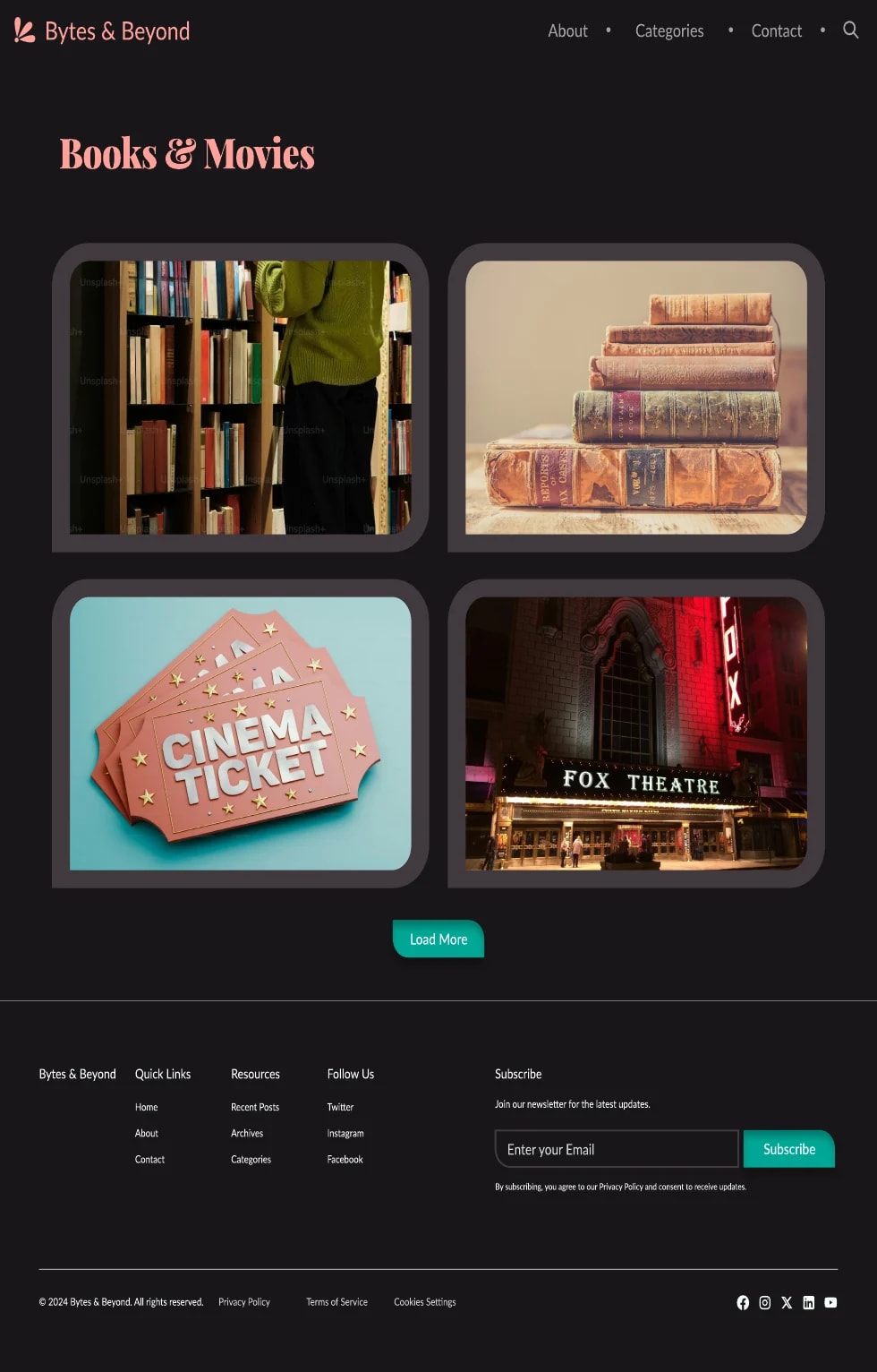
  • Books & Movies category page with photo cards and a Load More button
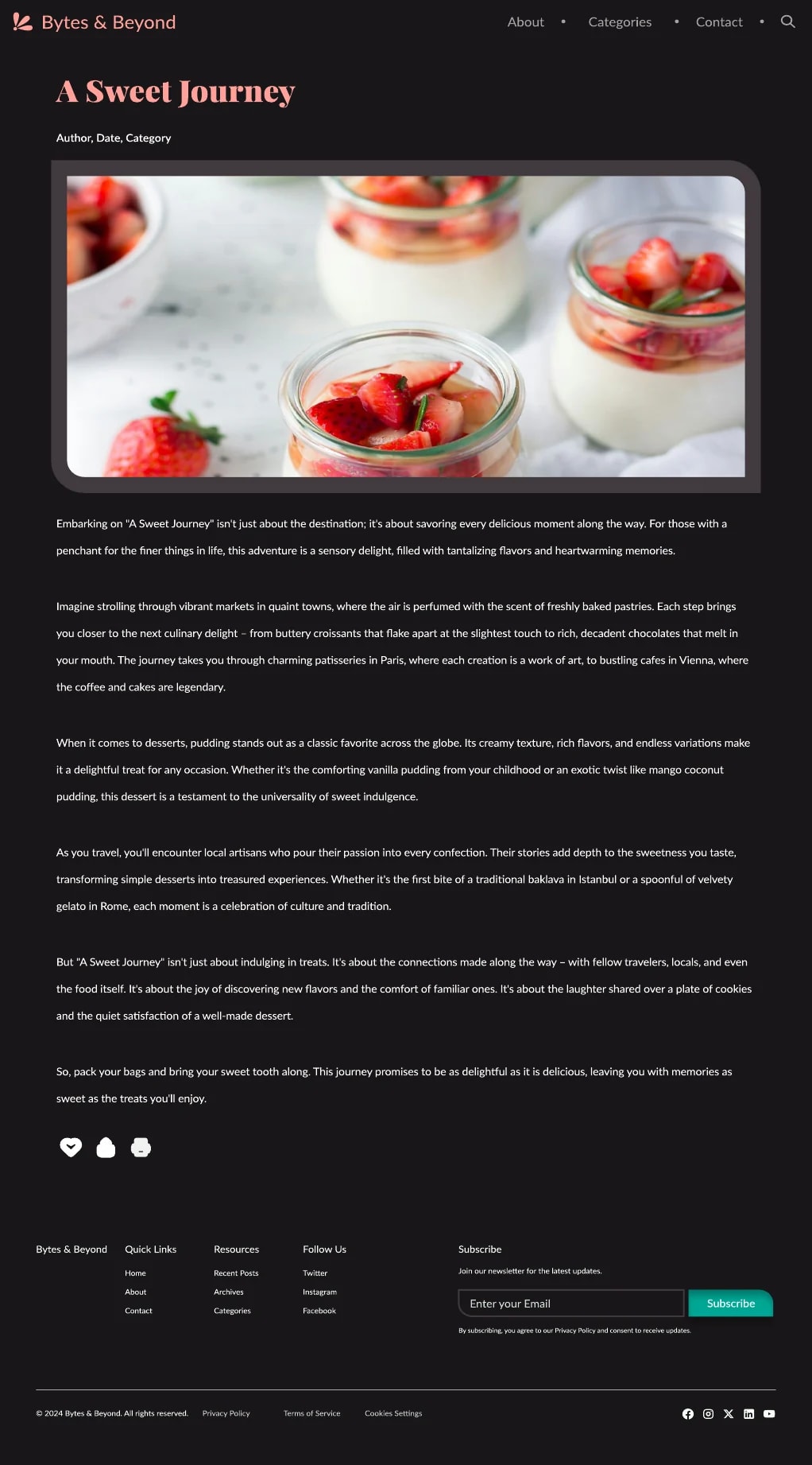
  • Blog post page, A Sweet Journey, with a photo of strawberry desserts and the article text